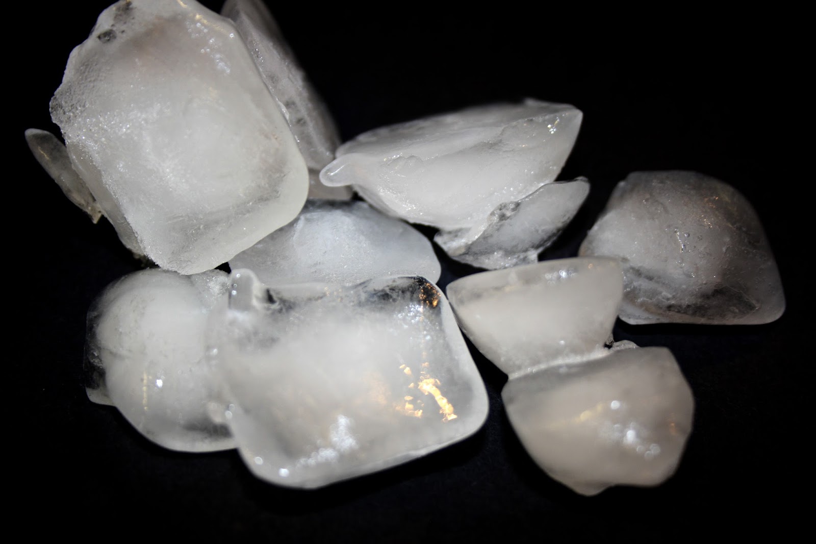
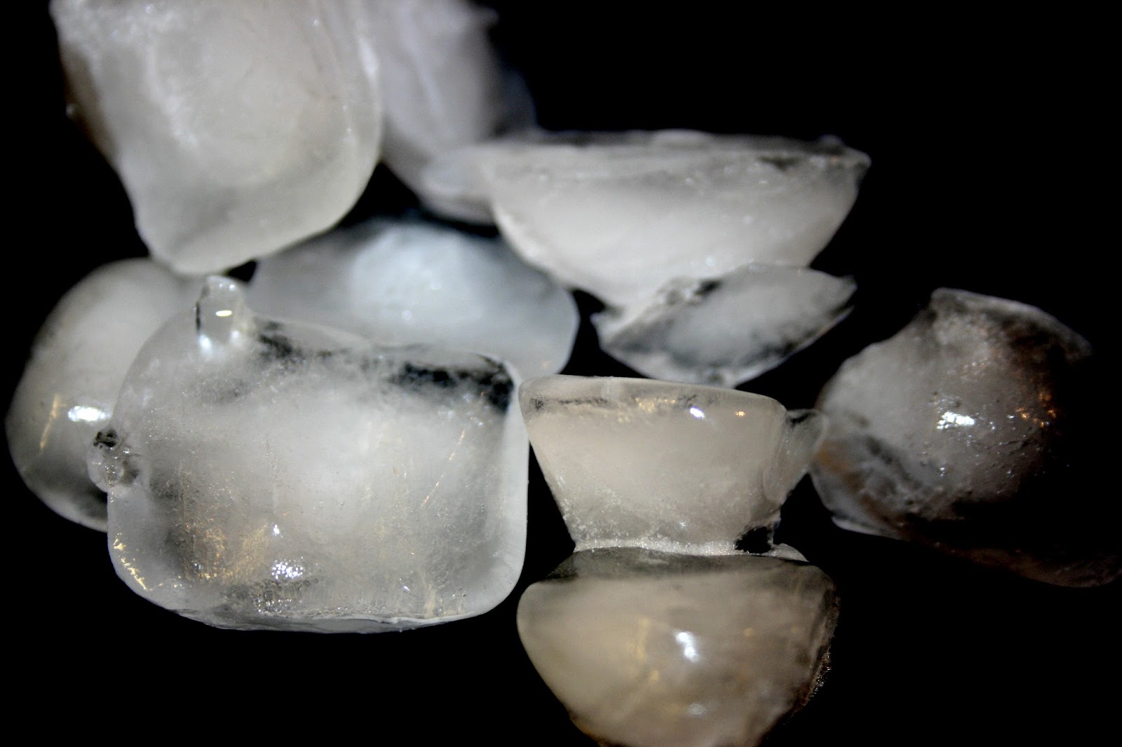
This is my cocktail menu design for a vodka bar that I created. It uses the colour blue to represent cold as this is how vodka is best served. Ive also used an image of ice cubes which I photographed myself, this works well within design as it relates to the subject but also fills up some unwanted white space.
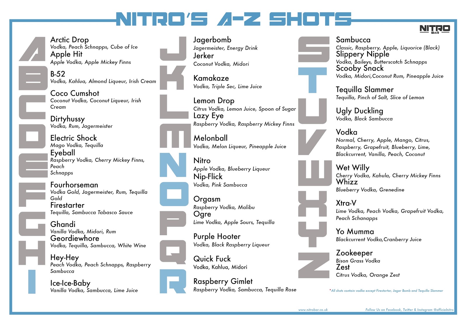
This is the shot menu for my vodka bar. I've called it 'Nitro's A-Z Shots' as there is at least one shot for every letter of the alphabet. I have also included the alphabet in the design, highlighting the word nitro but making the letter blue. This then relates to the theme of coldness.